01
Trevarrian Cornish Creamery
- PACKAGING
Brief
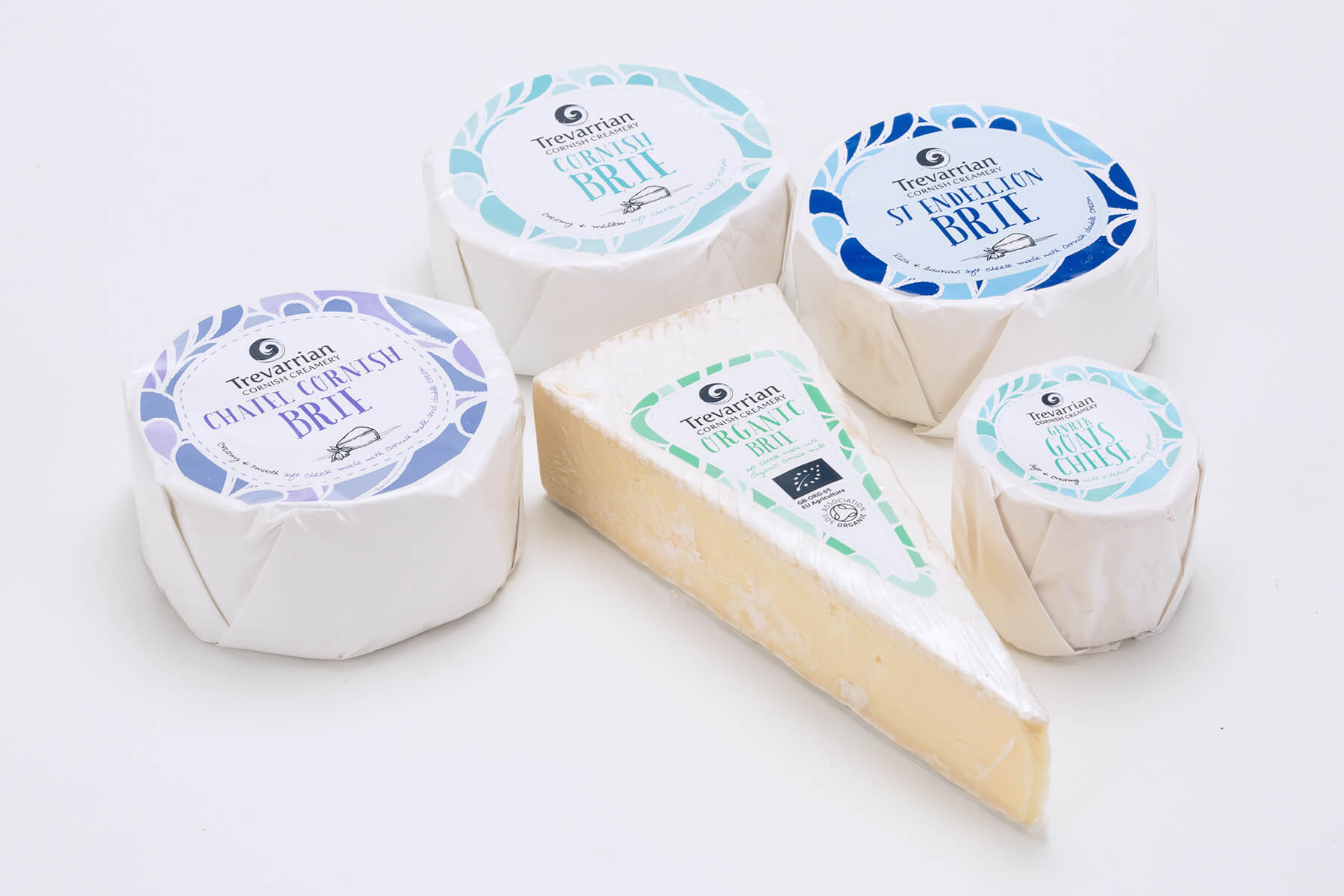
Create relevant, modern and fresh packaging that clearly communicates Cornish provenance. Trevarrian Creamery will be a stand-alone brand and will be unsupported by a larger brand, therefore packaging and branding are key.
Process
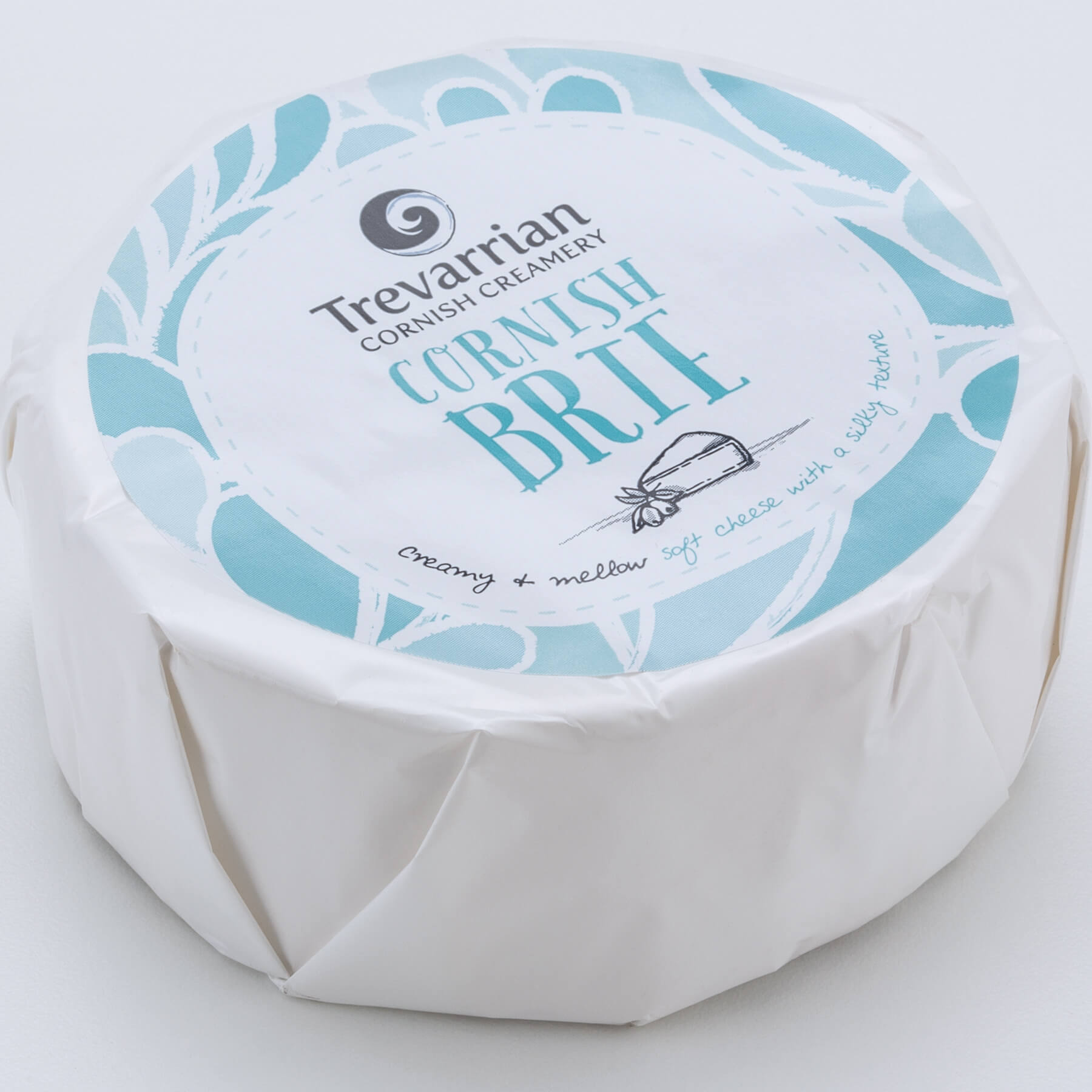
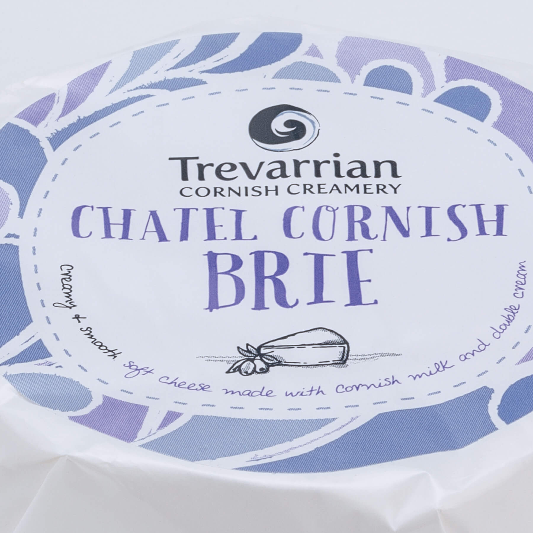
Experimenting with typography on a base of blues and greens, the packaging feels handcrafted and has an authentic, Cornish, nautical feel to them that appeals to the consumer. The final packaging range is quirky, friendly, fun and happy to be different.


